
Rad Cookie
Increasing sales by 12%
After years of continuous growth in the skateboarding retail industry, Rad Cookie's e-commerce effort reached a plateau. Limitations in features, performance, and functionality on the previous e-commerce platform prevented the company from providing a better shopping experience for its users. The time had come for a major overhaul of the platform and a brand refresh.
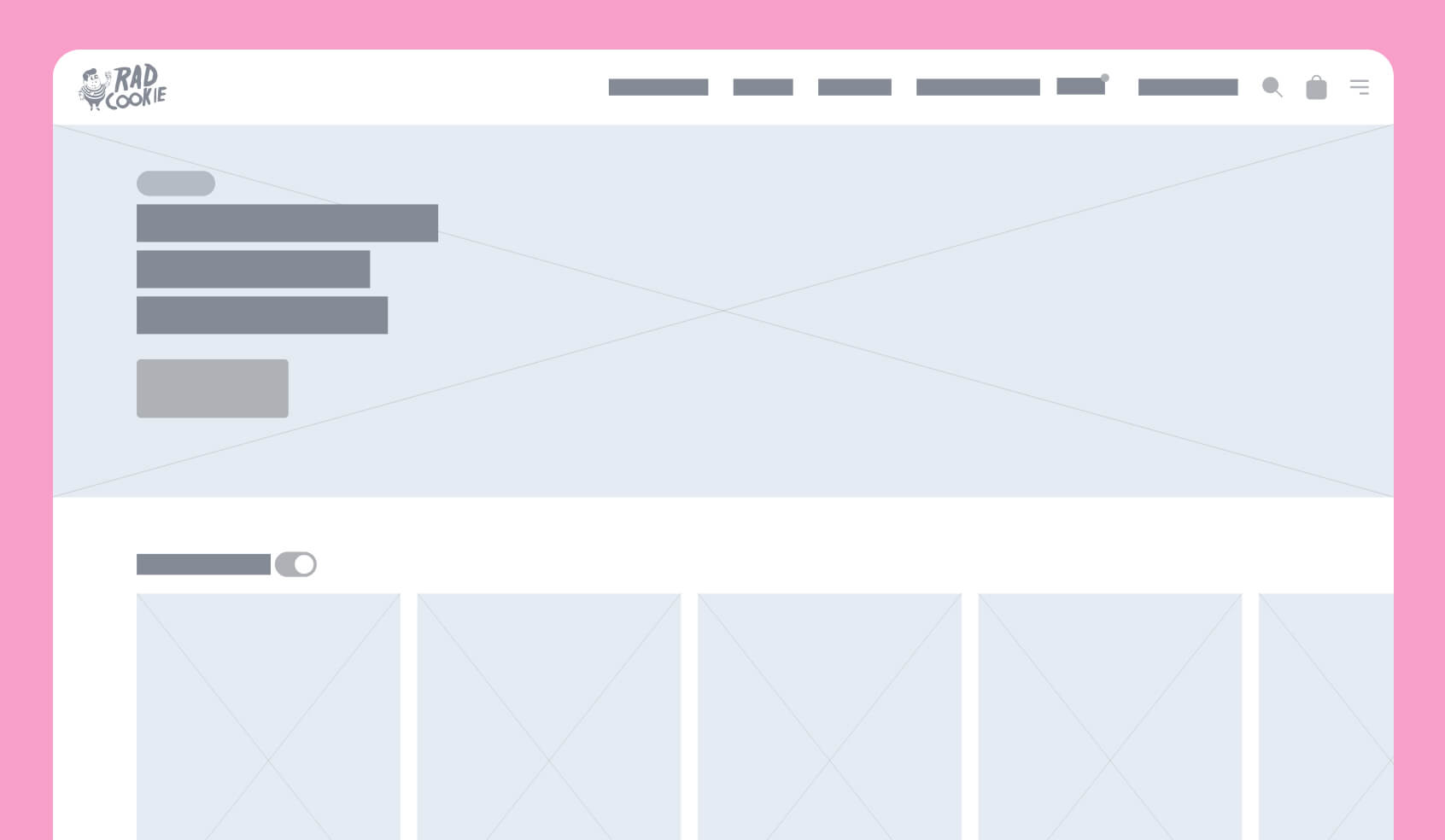
Preliminary wireframe
First wireframe done at the beginning of the design phase.
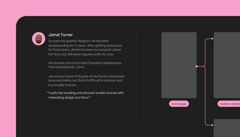
Persona
One of three personas based on user interviews.
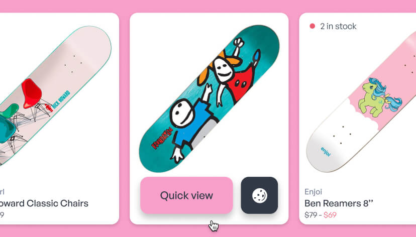
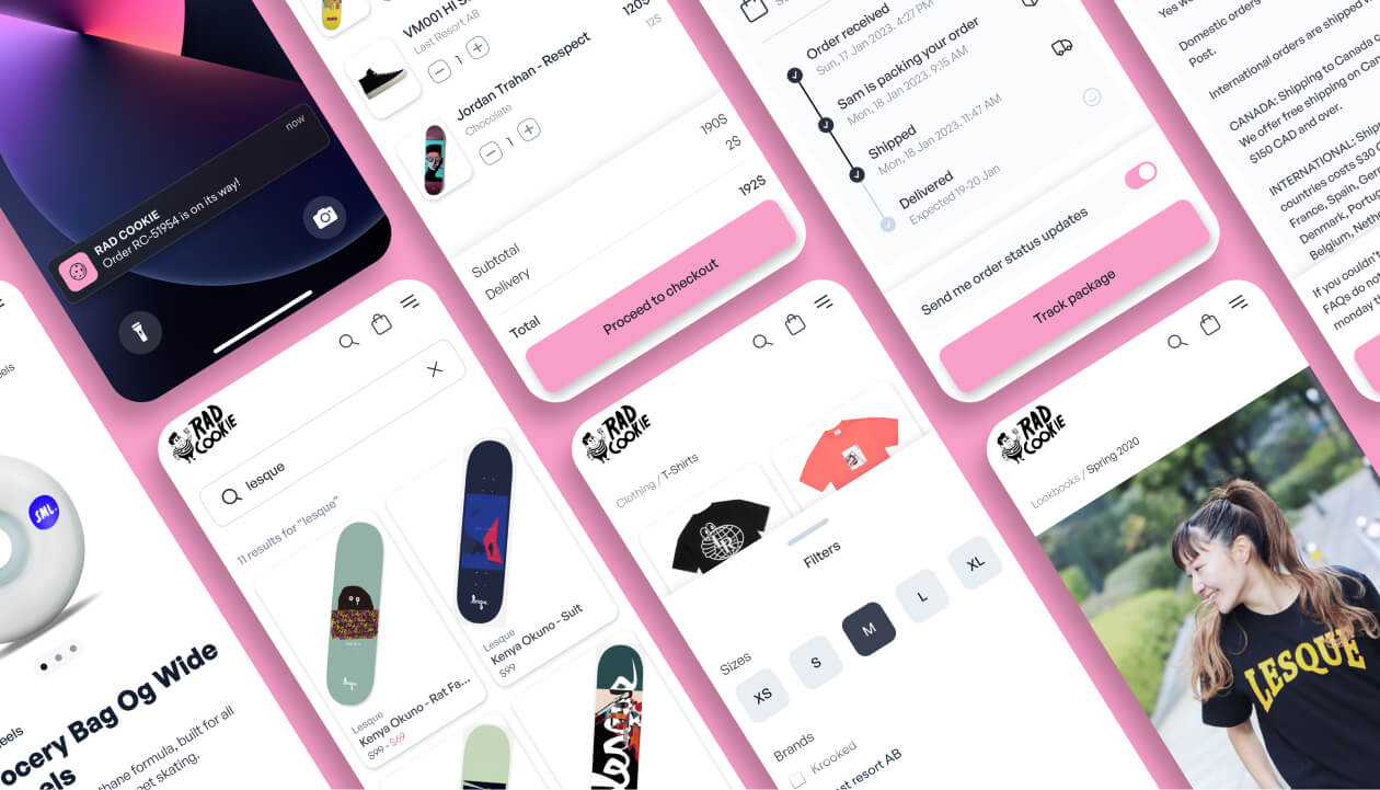
Rad Cookie product cards
Different states of product cards.
I was tasked with designing the user experience and user interfaces and collaborating with the marketing team to help revamp the branding. Usability testing unveiled fundamental problems, like users not realizing how much product diversity was available and paradoxically being unable to focus on new stocks and styles.
Since the UX problems were deeply rooted in the previous platform, we decided to redesign and rebuild the platform from scratch. Extra care was put into the homepage and navigation, making sure everything was simple and fast.
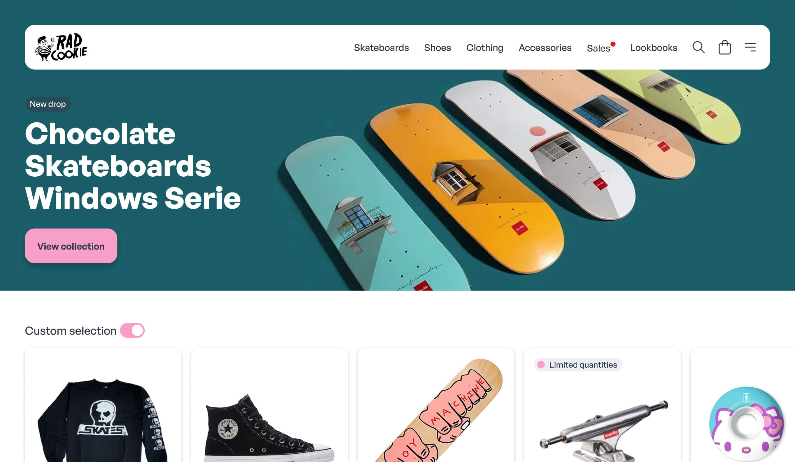
Home page
Featured product and personalized suggestions.
During the ideation phase, we went through several different design concepts that unfortunately did not satisfy user needs. One design concept we tested displayed only curated products on the home page, making users feel like they were missing out on something or preventing them from discovering new products. After many design iterations and back-and-forth discussions with stakeholders, we finally got the sign-off on the final solution. After some unforeseen tech hurdles, the revamped store platform launched—two weeks late.
The new store design resulted in an increase in the number of items per transaction compared to the previous design. Users were able to scan through a curated list of products while still discovering new products organically. We also improved the shopping cart screen to display suggested products based on user purchase history and other factors like season, date of last purchase, upcoming holidays, and so on. It wasn't an easy sell given the amount of development required, but we managed to come up with a scaled-down but still effective solution.
Miscellaneous screens
Some of the redesigned screens.
Estimated time of arrival
ETA is calculated in realtime.
Allowing users to switch between curated and filtered product modes increased the number of items per transaction. All the new features and improvements resulted in a 12% increase in overall sales and bumped customer satisfaction surveys by a couple of points.
Prototyping and testing were key to confirming new design concepts early in the process and ensuring we were on the right path. As a bonus, it made stakeholders more confident about the redesign initiative and allocating resources to complete the project.